Typography

The typeface we use throughout the Thrive platform is Halyard Display, by Darden Studio.

Modular Page Styles

The following typographic styles are used on modular pages within the mobile apps, including the various headings, paragraphs, links, and blockquotes. Line height should be set at 1.3em for all headings and paragraphs.

  • Modular Page Heading One
    The quick brown fox jumps over the lazy dog
    Size: 27px Weight: Bold Letter-Spacing: 0px
  • Modular Page Heading Two
    The quick brown fox jumps over the lazy dog
    Size: 21px Weight: Medium Letter-Spacing: 0
  • Modular Page Heading Three
    The quick brown fox jumps over the lazy dog
    Size: 18px Weight: Medium Letter-Spacing: 0
  • Heading Number Four
    The quick brown fox jumps over the lazy dog
    Size: 13px Weight: Semibold Letter-Spacing: 0.8px
  • Modular Page Paragraph
    The quick brown fox jumps over the lazy dog
    Size: 17px Weight: Book Letter-Spacing: 0
  • Modular Page Blockquote
    "The quick brown fox jumps over the lazy dog"
    Size: 17px Weight: Regular Letter-Spacing: 0
  • Modular Page Image Caption
    The quick brown fox jumps over the lazy dog
    Size: 14px Weight: Book Letter-Spacing: 0
Modular Page styles Modular Page styles

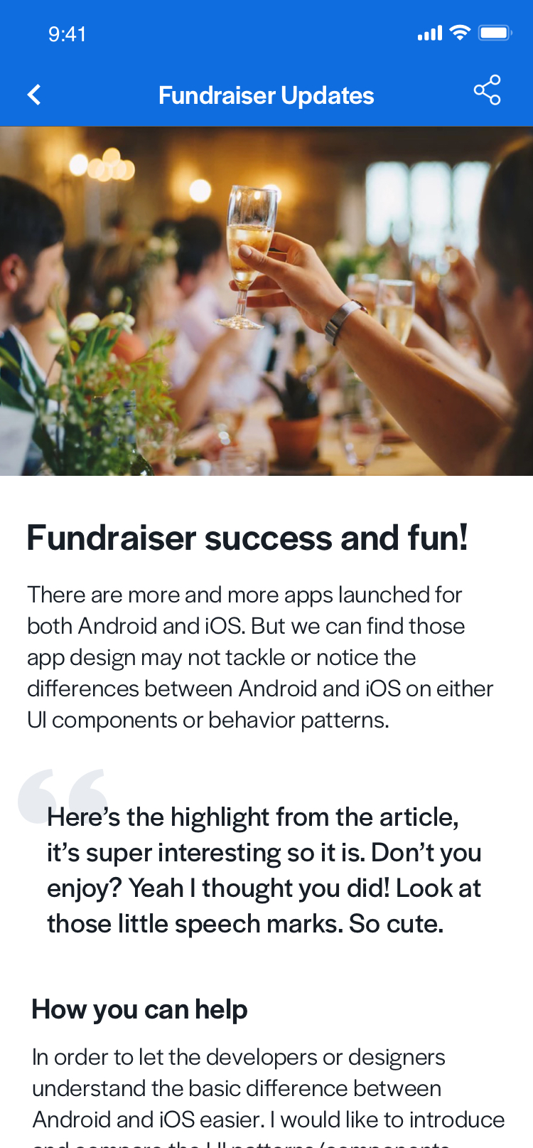
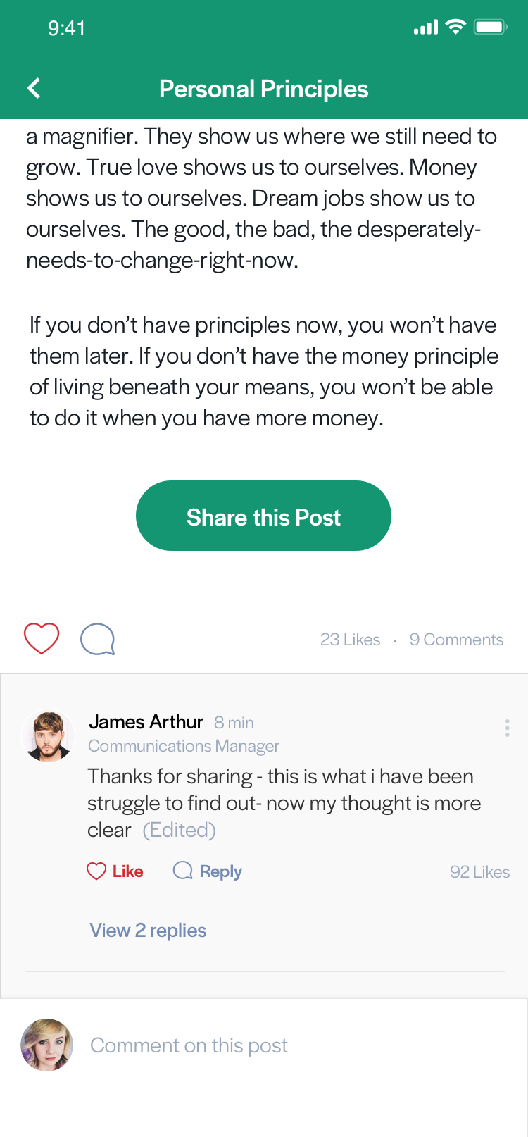
Modular page type styles and typography in a Recognition post

Social Interaction Styles

The styles below apply to the social action bar on modular pages and to the comments displayed at the bottom of the page.

  • Social Statistic on Social Action Bar
    21 Likes 3 Comments
    Size: 13px Weight: Book Letter-Spacing: 0
  • Commenter Name
    Riley Keough
    Size: 15px Weight: Medium Letter-Spacing: 0
  • Commenter Information and Like Count on Comment
    Communications Manager
    Size: 13px Weight: Book Letter-Spacing: 0
  • Comment Body
    Hey, here's a comment about the topic of this post
    Size: 16px Weight: Book Letter-Spacing: 0px
  • Comment Reply Link
    Size: 13px Weight: Medium Letter-Spacing: 0px
Comments on a modular page Comments on a modular page

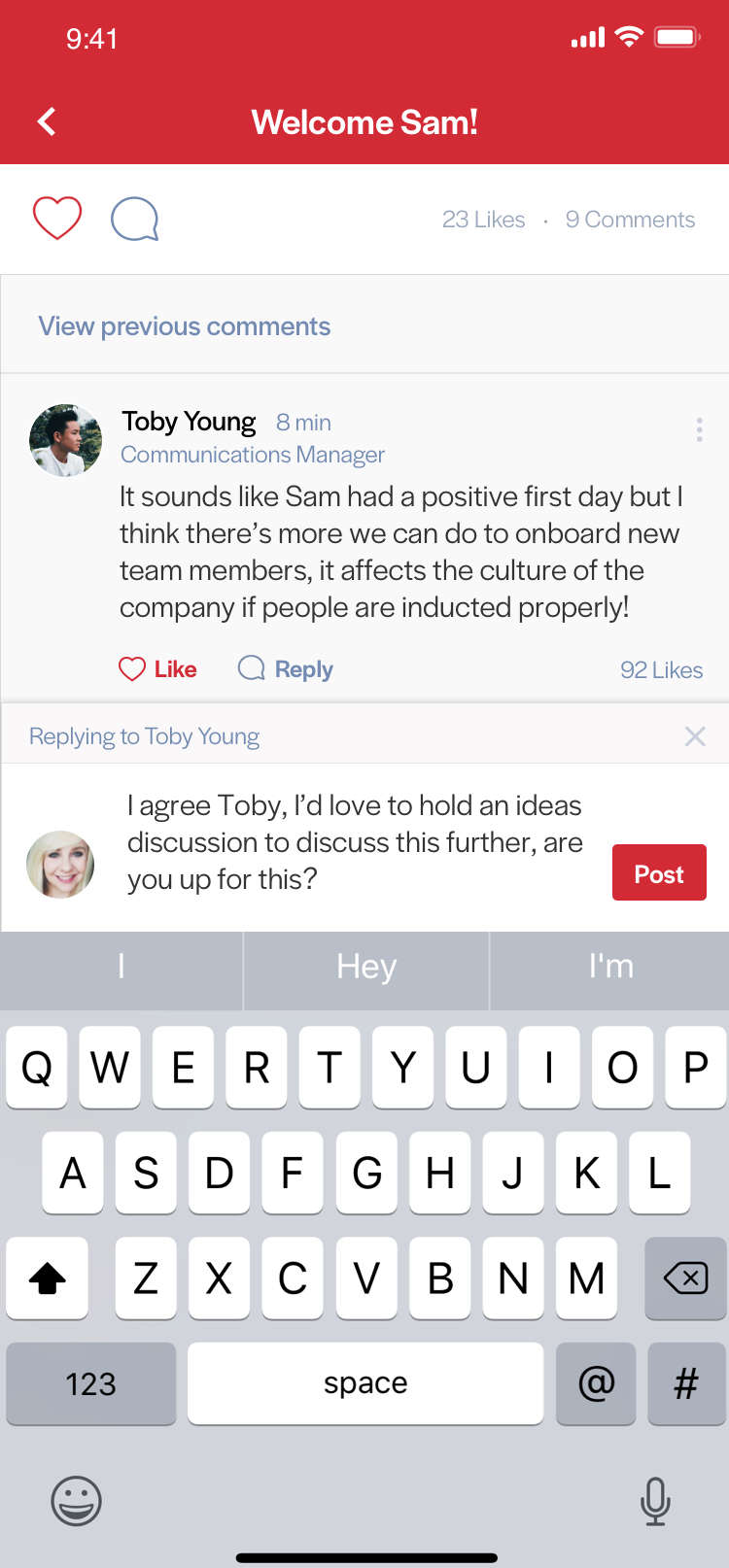
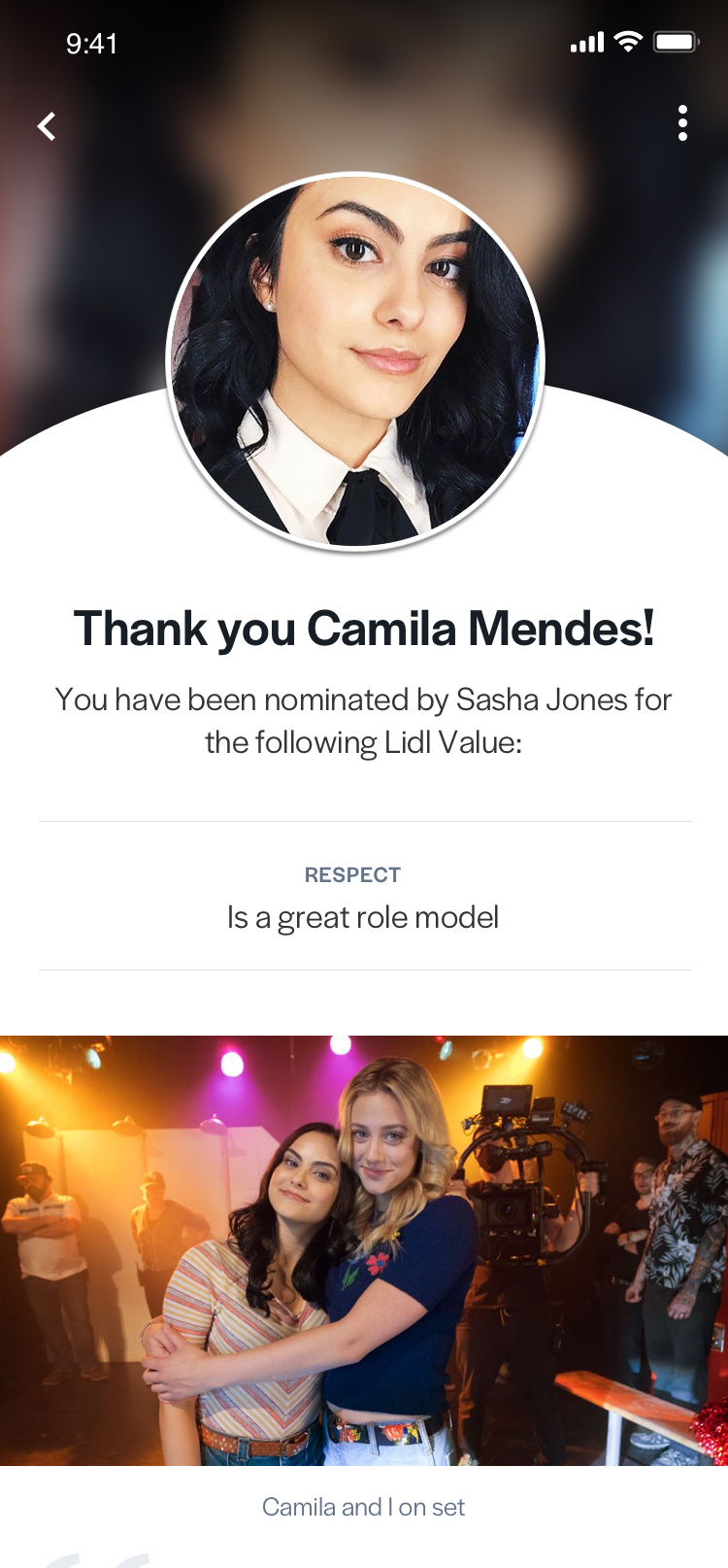
Social styles seen in the comment section of modular pages

General Screen Styles

The following styles apply to many app screens including onboarding and settings screens.

  • General Heading One
    The quick brown fox jumps over the lazy dog
    Size: 21px Weight: Medium Letter-Spacing: 0px
  • General Paragraph
    The quick brown fox jumps over the lazy dog
    Size: 17px Weight: Book Letter-Spacing: 0
  • General Link
    Size: 17px Weight: Regular Letter-Spacing: 0px
  • Notification Body Text
    Size: 15px Weight: Book Letter-Spacing: 0px

List Layout Styles

Mobile lists can make use of various layouts, and though they each have distinct visUal looks, they are made up of the same components and share text styles.

  • Large List Title
    The quick brown fox jumps over the lazy dog
    Size: 17px Weight: Regular Letter-Spacing: 0px
  • Small List Title
    The quick brown fox jumps over the lazy dog
    Size: 15px Weight: Regular Letter-Spacing: 0px
  • List Item Metadata (Social Statistics and Timestamp)
    The quick brown fox jumps over the lazy dog
    Size: 13px Weight: Book Letter-Spacing: 0px
Onboarding list layouts

General screen styles seen in onboarding screen and list layout type styles