Navigation
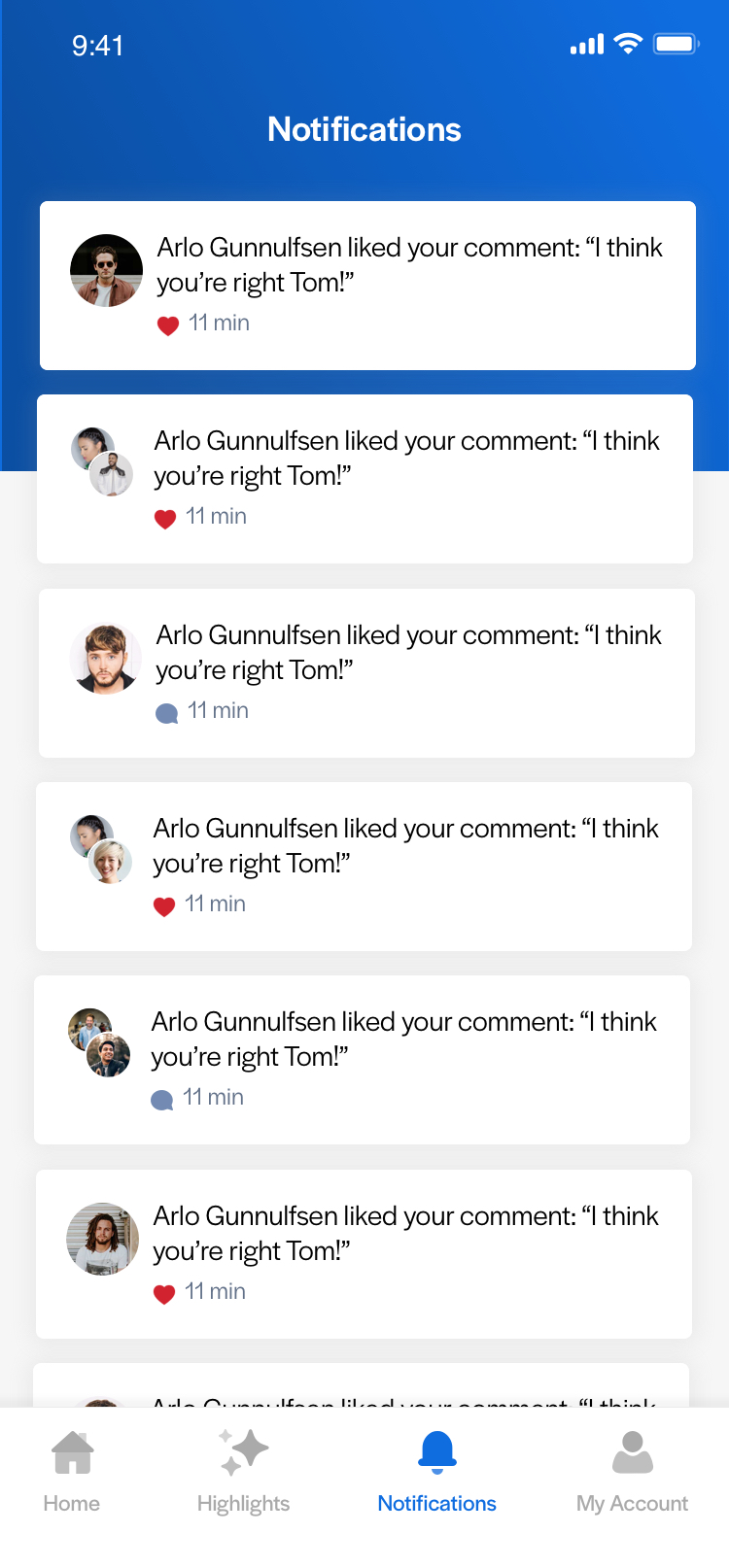
Tab Bar
Thrive’s mobile app uses a tab bar menu to allow its users to rapidly switch between the core areas of the app. The tab bar contains links to the home screen, the highlights feed (if enabled), the user's notifications and their account. It is persistent throughout the main areas of the app, however when users move into deeper areas, the tab bar will no longer be in view. For example, if a user moves into a modular page from a list, it will be replaced by the social action tab bar.
The tab bar communicates the current location by the use of visual cues, including the colour change of the icons and labels. The colour is determined by the brand colour set by the App Editor. Notification bagdes appear on each icon to alert users of new activity or items that require their attention.
Sliding Menu
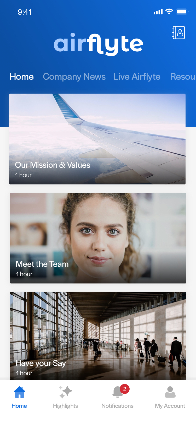
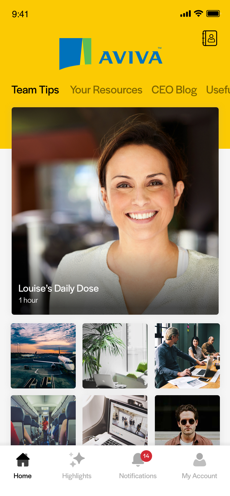
App Editors have the ability to create their own content and structure thoughout the app using the CMS. They can create top level lists that can contain pages, media or more lists. This content appears within the "Home" tab, the first area of the app that users will see upon opening the app.
To encourage discoverability and allow for easy navigation throughout the app content, the lists are presented as columns beside each other, with only the "active" list in view at any one time. Users can scroll down each list and tap into content items to open pages, media items and inner lists.
Users can slide the list left or right to reveal the lists next to it. The sliding action should feel fluid and responsive, and allow users to rapidly swipe through content sections.
Active List Titles
As the user swipes left and right through the content, the corresponding title will move left or right along with it. Inactive titles are black or white (depending on background colour chosen) at 50% opacity, while the active list title is shown at 100% opacity.
Navigation in the mobile app
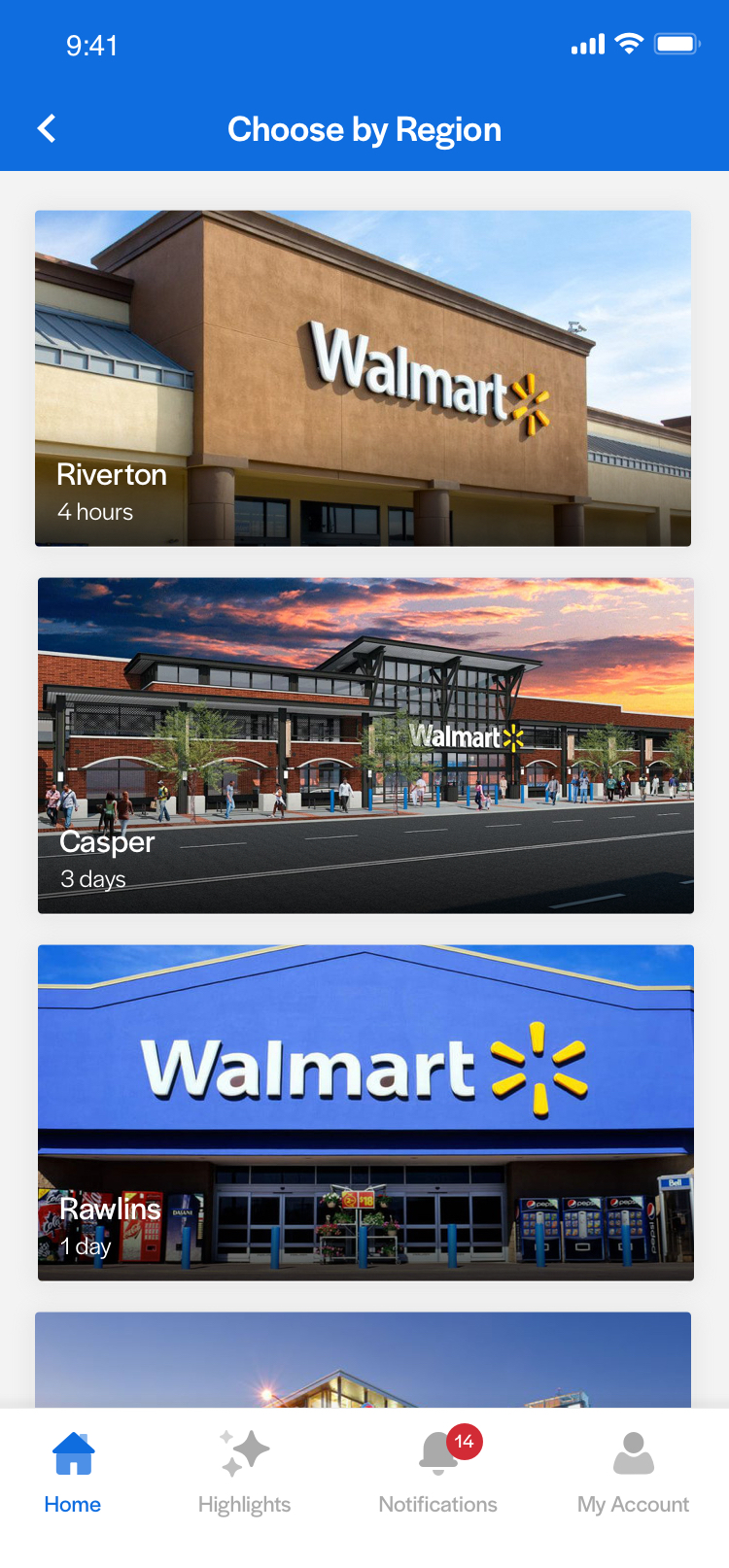
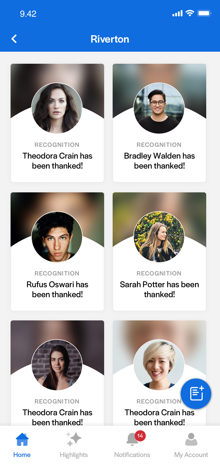
Lists Within Lists
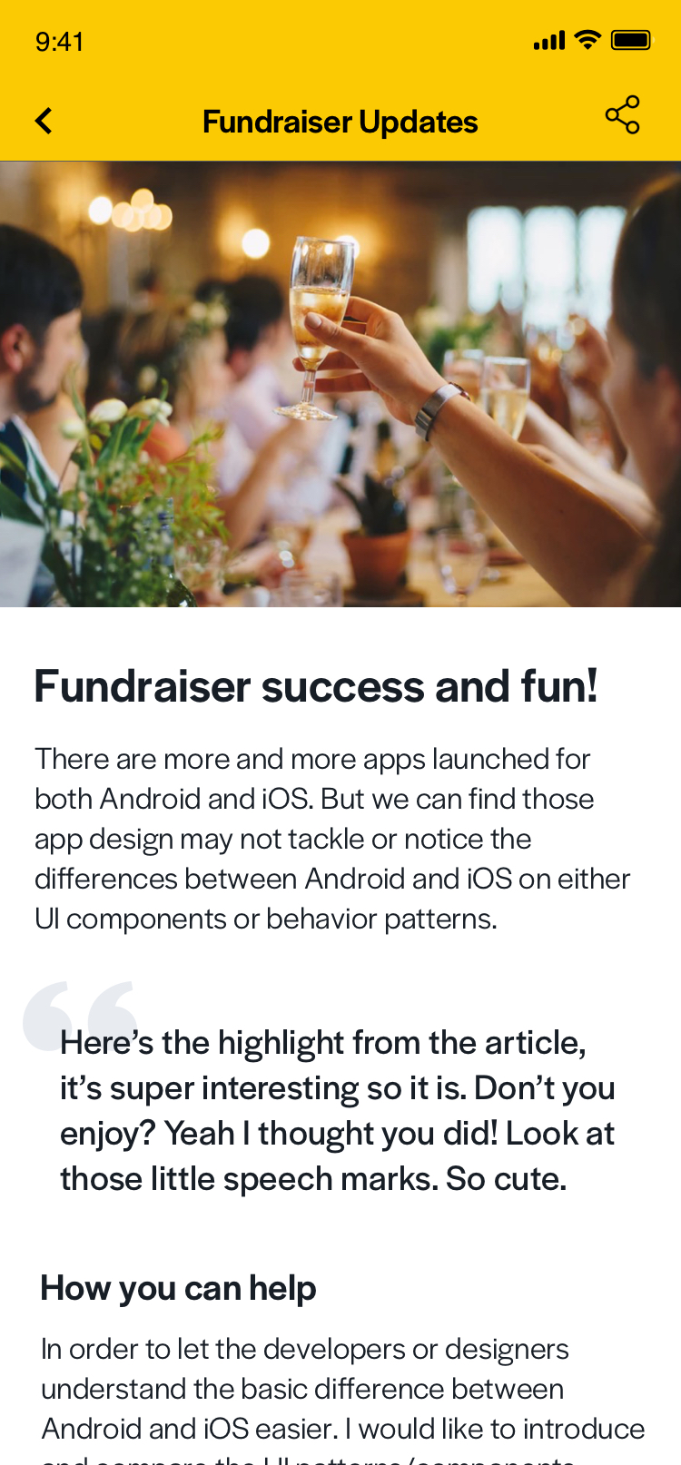
If a user taps on a list item in the top level which leads to another lists, this nested list appears slightly different as the title bar changes. Instead of the top level menu items and branding elements, they'll see a typical titlebar and back button to allo them to navigate back to where they were. Lists can be many levels deep, so the same pattern of showing list layouts within a simple page with a titlebar and back button continues.
For example, a user could tap on a list item (or tile) that says "Recognition" on their home screen. This could lead them to a list showing various regions the company operates in, and tapping on one of these could show a list with all of the recognition posts made for that region.
A nested list then a deeper nested list shown
Android and iOS Differences
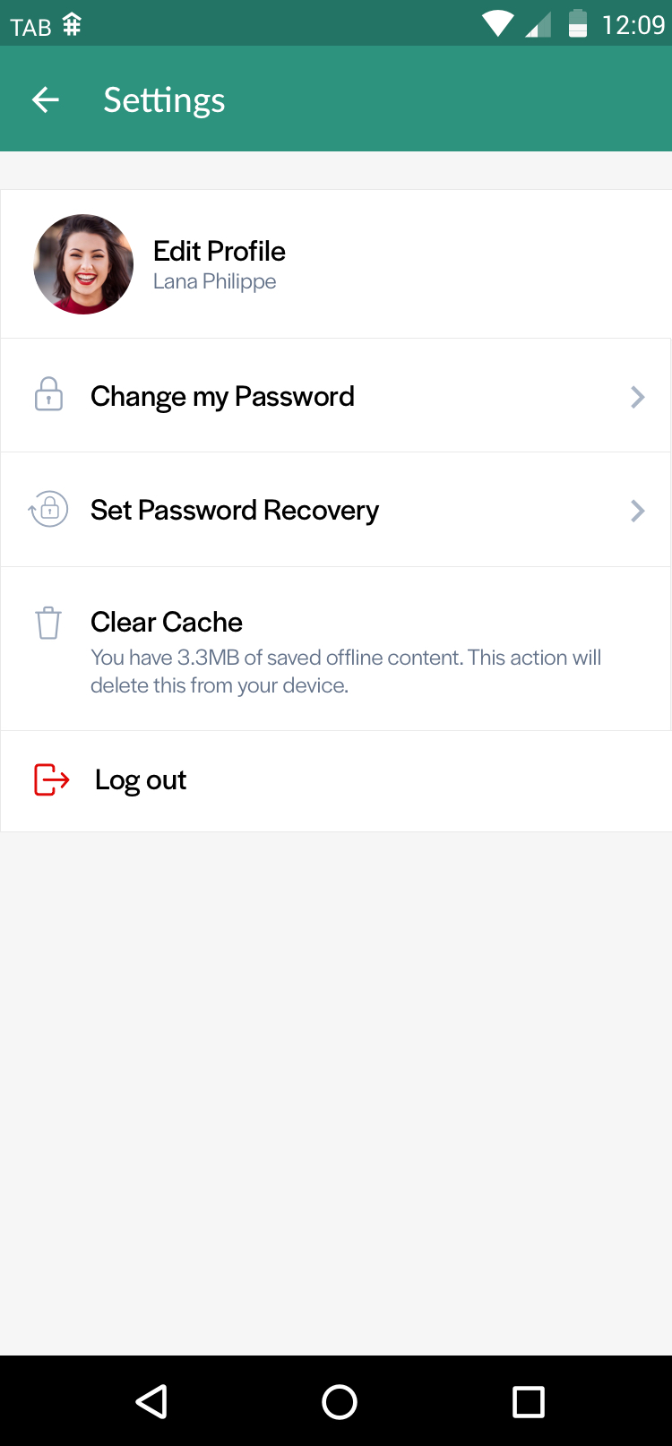
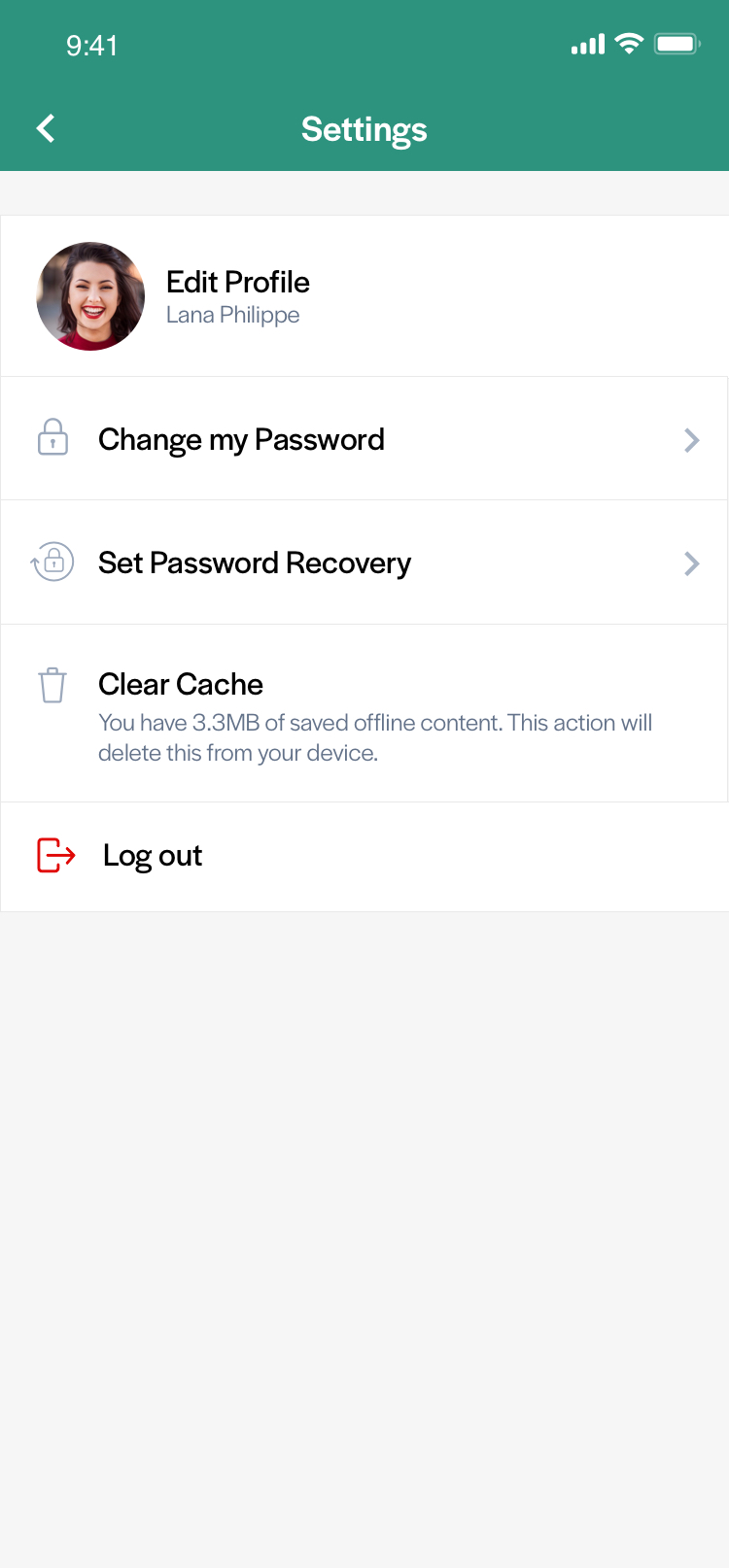
While most of the UI in the Android and iOS versions of the app remain identical, there are some elements which are specific to their operating system. This includes back buttons. Both iOS and Android use their default back arrows which looks distinct.
The placement of the title is slightly different on the operating sustems too as iOS centers titles but Android places titles more to the left side of the titlebar. Icons in the titlebar should be right-aligned.
Android and iOS diffences in the title bars
Branding and Text Colours
Since the background colour of the title bar can be any colour specified by the App Editor, the overlaid title text and icons must be adaptable.
We export 2 versions of each icon that are displayed on the title bar, a light version (white) and dark version (black). A specific colour algorithm to identify if the background colour is considered light or dark, enabling us to choose whether black or white text/icons would be more suitable the app.
The colour of the status bar will also change according to background to colour on iOS, but status bars on Android should not affected.
The text colours in the title bars will be black if the branding colour is set to a light colour, such as bright yellow