List Layouts
App Editors can create the content structure for their apps by adding lists, pages and media to their app. This content is displayed as lists for which the App Editor can select from a variety of list layouts.
The variety of list layouts give App Editors many options for organising their content visually as they can choose the layout that best suits the content.
List Item Elements
List items are the blocks which contain content within a list. The elements that make up a list item are:
- Title
- Icon
- Time Stamp
- Featured Image
- Gradient
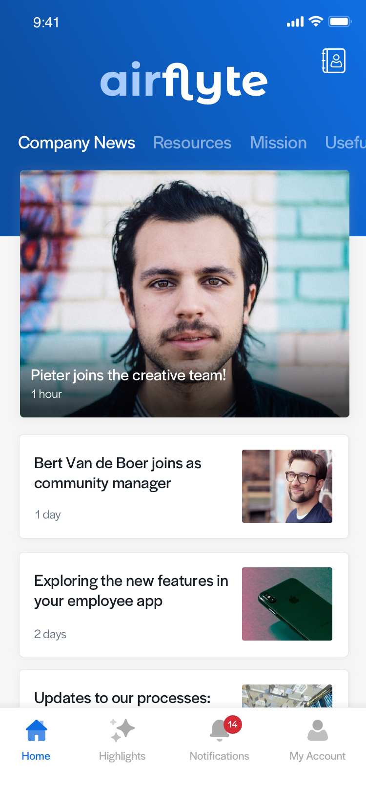
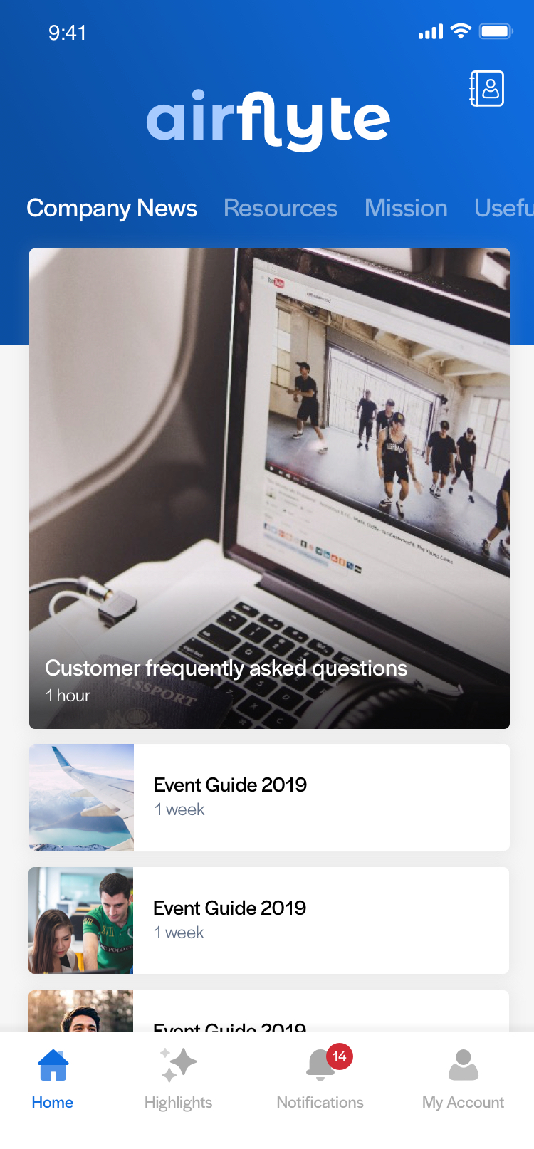
The CMS gives App Editors flexibility in how their lists look in the app, as they can choose to display or hide some list elements including the list icons, time stamps and gradients. Titles will always be shown, as will the featured image if the list is a visual one.
Heros in List
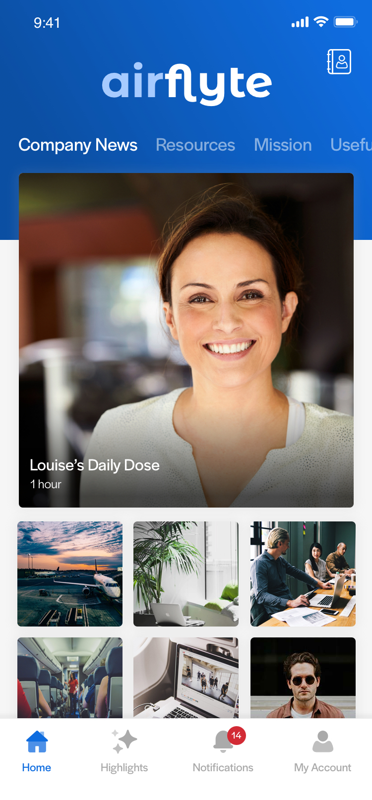
Add Editors have the ability to add a "Hero" to their lists, which simply transforms their top list item into a large visual tile. The Hero shows the featured image with the title and other list components overlayed on top. The hero item reflects the ratio of images in the chosen list layout so will be either square (1:1) or rectangle (4:3).
Our List Layouts
There are currently 9 list layout designs available to choose from. Images are presented in either a 1:1 (square) ratio or a 4:3 (rectangle) ratio, with the exception of Letterbox layout which uses a 45:23 ratio.
If no feature image is chosen for any list item, a placeholder image should take its place, representing the type of content of the list item. For example, if a user adds a video to a list with no featured image, the placeholder image chosen should be the video specific one.
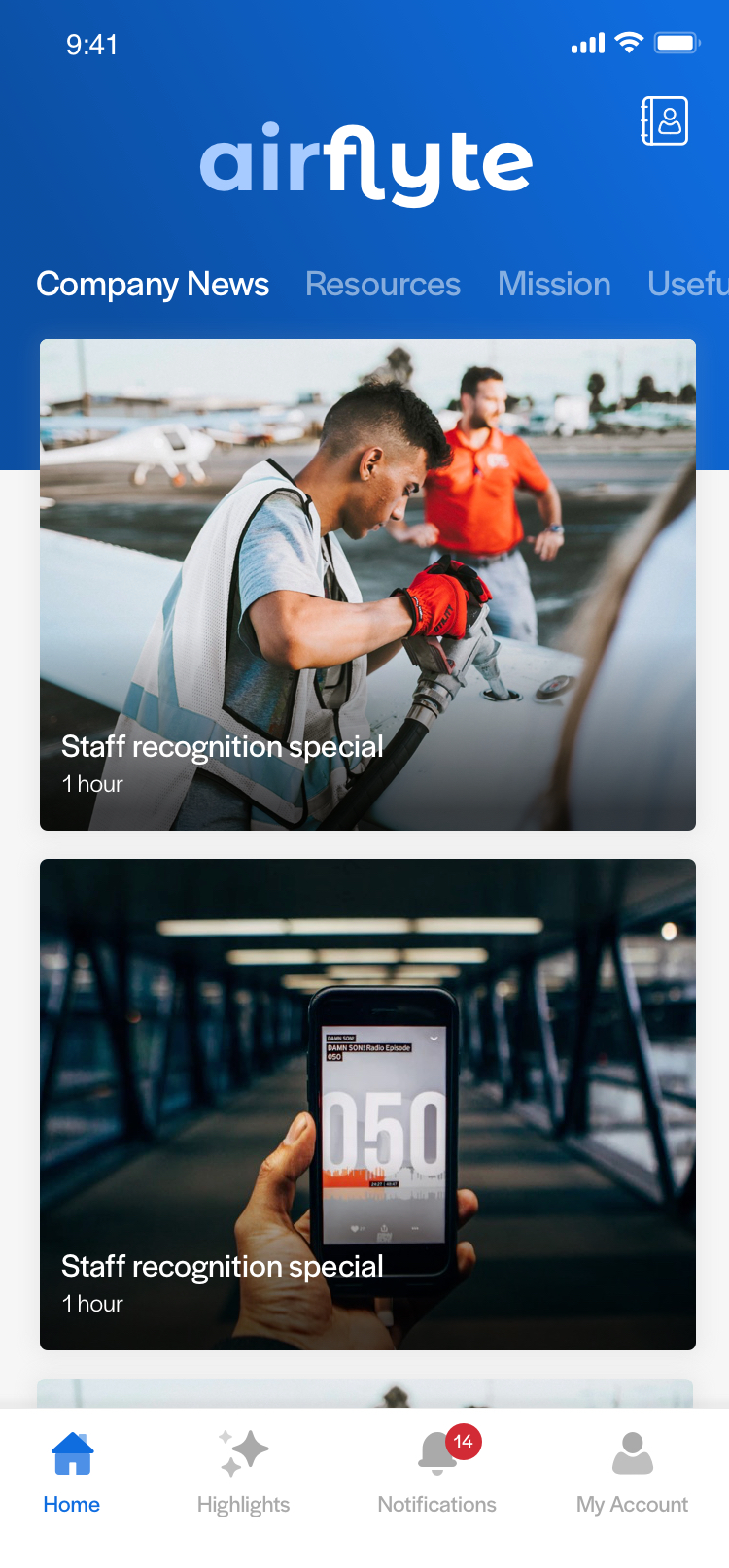
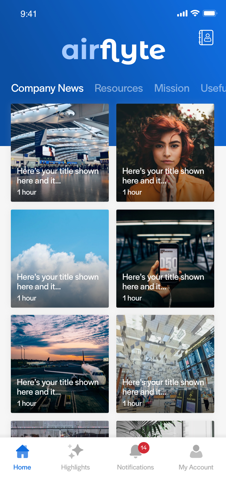
Mag
Mag presents list items one per row and is best suited to lists that have good quality imagery as this list is very visual. Mag list uses the 4:3 ratio. Since the text elements are placed on top of the image background, it is advisable to use gradients to provide more contrast being the text and image.
Letterbox
If App Editors want to make their list very visual with the use of imagery, but perhaps want to display more items on screen at any one time, Letterbox layout would be a good option. If shows the featured image as the background with textual components overlayed on top of it. This list layout uses a unique image ratio.
Mag list (left), and Letterbox list layout
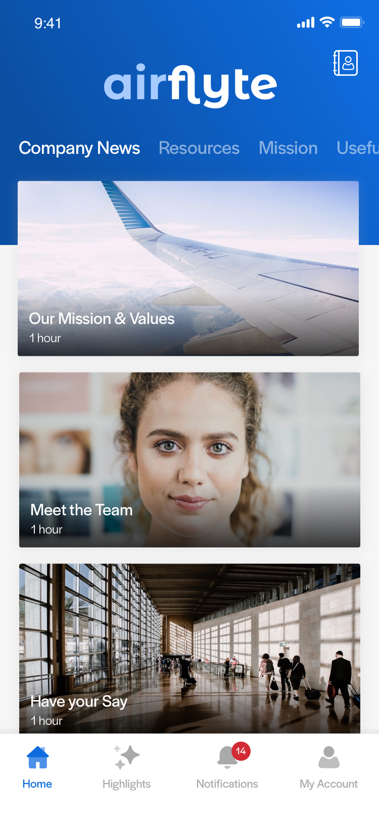
Polaroid
Similarly to Mag list, Polaroid List displays 4:3 images and one list item per row. This list displays the text elements below the image on a white background so the full image can be viewed more clearly.
Mini Polaroid
Mini Polaroid is variant on Polaroid list, with the main differentiator being that two list items are displayed per row, allowing users to see more posts on the screen at any one time. If an App Editor chooses to include a hero in this list type the hero item will use the design for the Polaroid list type.
Polaroid list layout (left), and Mini Polaroid Layout with a hero
Square
Square list layout shows two list items per row and is square in shape, and the image backgrounds use the 1:1 image ratio. Similarly to Mag list layout, the text elements are overlayed on top of the image.
Headline
Headline list showcases a more minimal design and displays one list item per row. Featured images are shown on the right side of the card, but if no featured image is chosen the title text simply span across the full width of the card.
Square list with a hero (left), and Headline list layout also shown with a hero
Compact
Compact list is a suitable way to display a list of files within an app, as it encompasses a minimal design and takes up the least vertical space out of all of the list layout options. Featured images are displayed on the left of the card in a 1:1 ratio.
Gallery
For completely visual lists, App Editors can use Gallery list layout. This simply displayed the featured image with no other text element shown. However content-type icons are shown in the top-right corner of the list item if enabled.
Compact list with a hero (left), and Gallery list layout
Recognition
Unlike the other list layouts, the Recognition layout is only available to Recognition lists. The imagery and text is specific to recognition as the title of each list item is "[Person's Name] has been thanked!" and instead of a featured image, this layout shows the thanked person's profile picture. The profile picture is presented in a circular mask, and a blurred version of the profile image is used as a background.
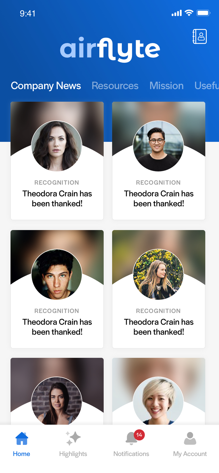
Recognition list layout