Buttons
Buttons are found throughout app to indicate the primary action a user can take on that screen, for example, thanking a staff member or completing a step of the onboarding process.
Primary Buttons
Primary buttons are round, lozenge shapes and should take on the brand colour as set by the app editor. Depending on the lightness of the colour, the button text can be white or black.
Adjustable & Fixed Width
The buttons can be either a fixed width or they will adjust depending on the text label length. Fixed buttons are as wide as the screen container, such as buttons in onboarding screens, so as the user moves through the flow their won't be a visual "jumping about" of the button width. Conversely, adjustable buttons' width is determined by the label length and should always have 50px of padding on both the left and right side.
The buttons below illustrate how the button should look depending on it's state. Disabled buttons will change the opacity of the text inside the button from 100% to 50%. When a primary button is pressed the background colour should be darkened by 8%.
Secondary Button
Secondary buttons are used when there's an option to take an action on a page but it is not the primary task on that page. For example, they are presented on User Generated Content forms to allow users to add an image to their post, however "Publish" is the primary task of that form. They are also used when the primary task on the screen is choosing between multiple options, for example when choosing to provide a recovery mobile number or email address during the user onboarding flow.
Secondary buttons can also be a fixed width or adjust to the label inside the button as described above.
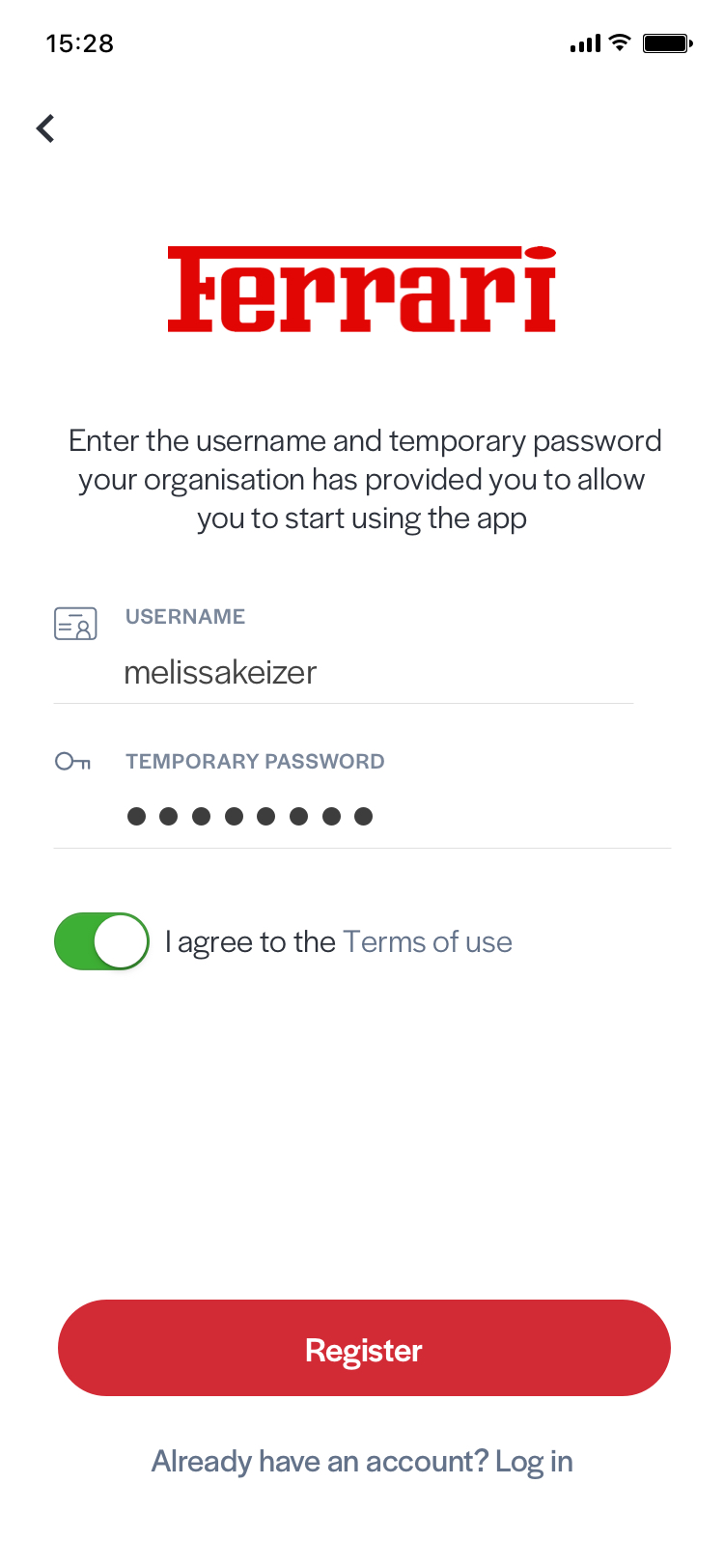
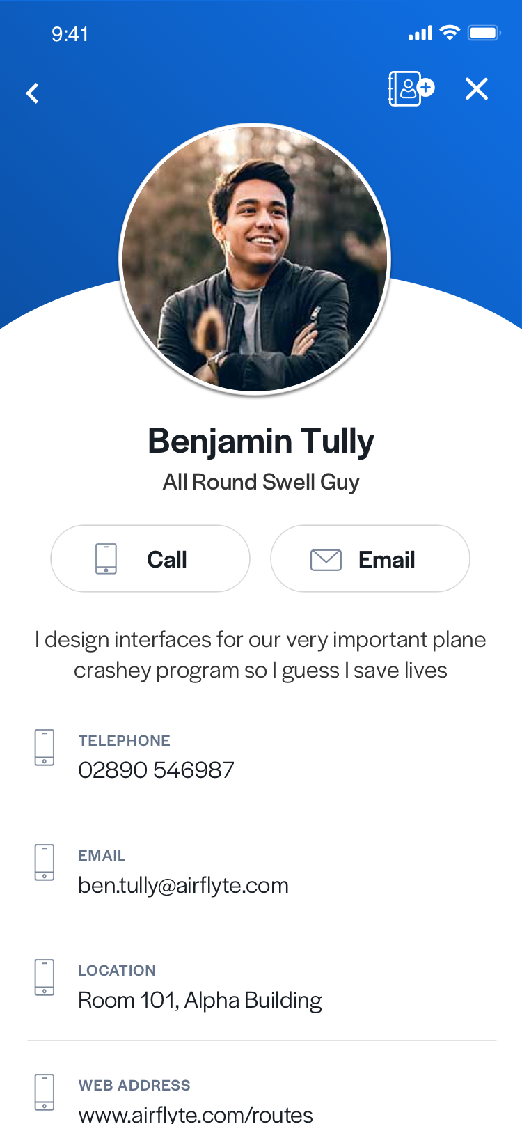
Primary button on register screen, and secondary button styles on a contact
Floating Buttons
Floating buttons are presented in lists that allow users to post content into them, such as recognition lists. They are circular buttons with a subtle drop-shadow to give the illusion that they are floating above the list content below.
Radio Buttons
If a user must make a choice between two options in a form, such as a Peer Recognition form, these options will appear as radio buttons. These buttons are similarly styled to Secondary Buttons however they can appear side by side and have less padding on the left and right sides (to make them more compact). Only one can be selected and the selected choice is highlighted by use of a $PrimaryBodyColor border.
Text Links
Occasionally links are presented underneath the primary button on a screen. They are used to give the user freedom of choice, and often the encouraged action is highlighted by use of a primary button, while the link below is quite understated.
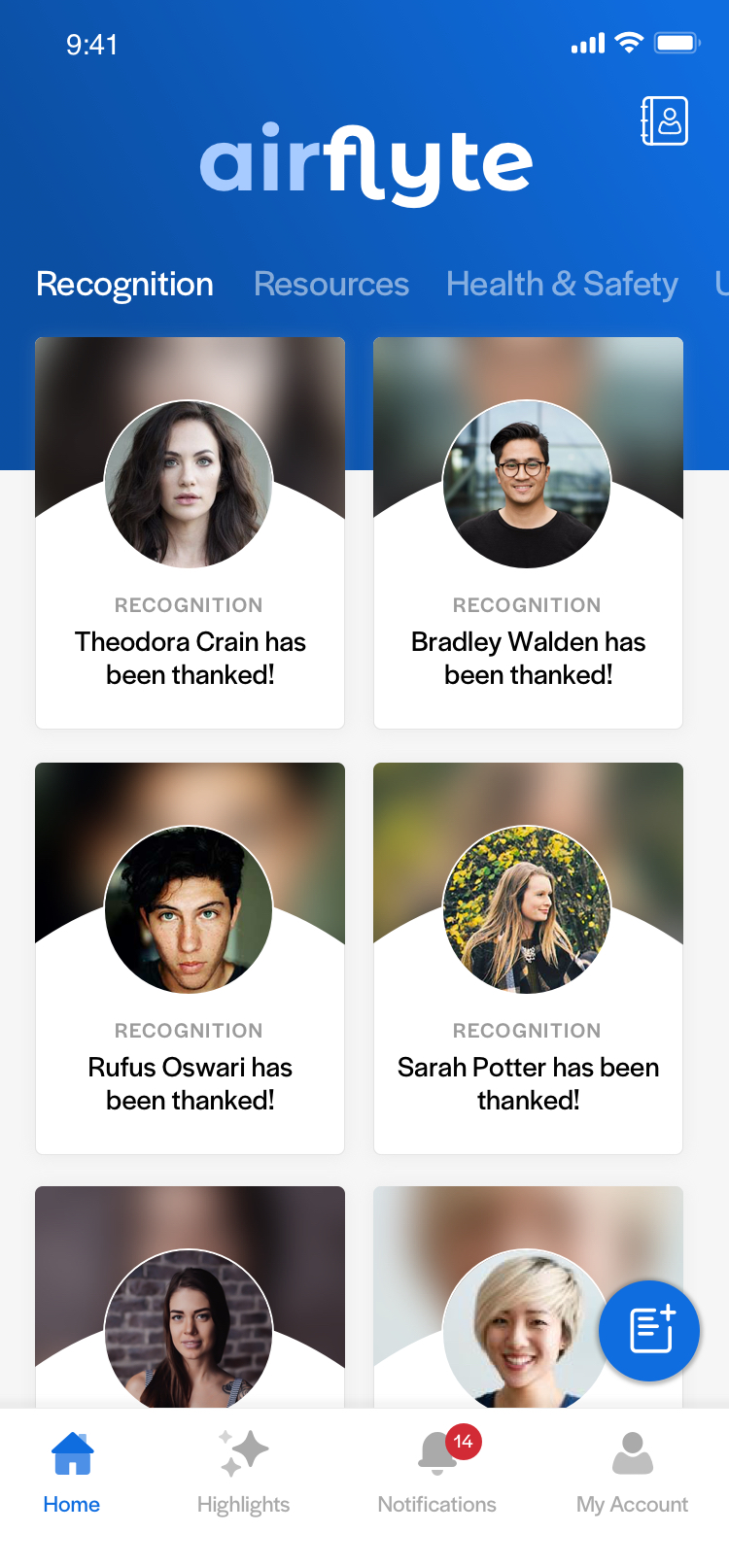
Floating action button on UGC list, and text link underneath primary button in onboarding screen